-
 Lindbert Guerra
1Hi every one: How all are doing well and all business are being successful; I just like to pick the very talented mids of of our Trimmers community on the best paint colors used for interior shops.
Lindbert Guerra
1Hi every one: How all are doing well and all business are being successful; I just like to pick the very talented mids of of our Trimmers community on the best paint colors used for interior shops.
If any one care to share some deas? I would be grateful. thanks -
 Cody Lunning
39Having 2 sisters in psychology and me starting school in this field we learned a lot about colors and how they effect the brain. If you’re looking for colors that help improve you mind and body here’s some reading.
Cody Lunning
39Having 2 sisters in psychology and me starting school in this field we learned a lot about colors and how they effect the brain. If you’re looking for colors that help improve you mind and body here’s some reading.
https://www.google.com/amp/s/redbooth.com/hub/colors-unexpected-productivity-boost/amp/
If you’re just wanting a nice color. I like warmer tones -
Lindbert Guerra
1Thanks Cody..exactly what am looking for ...very intersted in the color that help both mind and body to imporve..thanks buddy
-
 Nadeem Muaddi
86Great topic @Lindbert Guerra!
Nadeem Muaddi
86Great topic @Lindbert Guerra!
When we painted our shop we went with a two-tone. The roof and top half of the walls were painted white, while the bottom half of the walls were painted gray.
This was done for very practical reasons. Our craft is one that requires a lot of light. By painting the roof and top half of the walls white, we're able to keep the shop brighter.
The bottom half of the walls were painted gray because they're likely to get dirtier faster -- with exhaust smoke, dirt and other gunk. The gray masks that unsightly dirt and gives us longer time between paint jobs. -
Cody Lunning
39@Nadeem Muaddi good thinking! I didn’t even think about how the colors would effect light output in a shop.
-
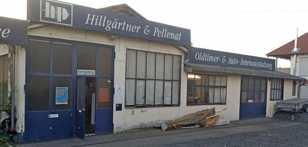
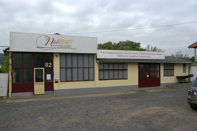
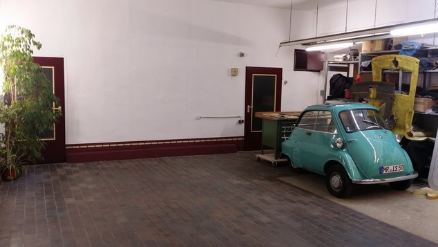
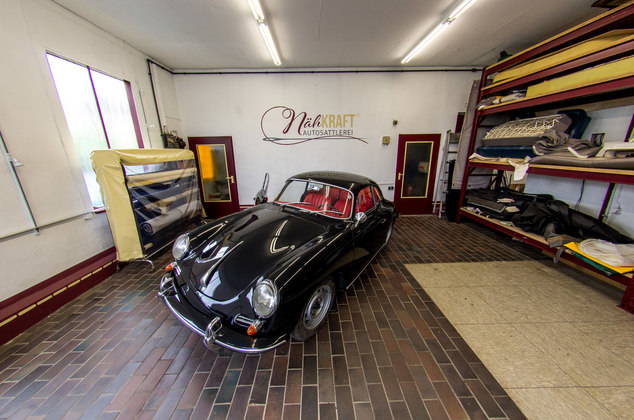
 Jens Jesberg
50When I took over my company I also thought about the colour design for a long time. Because Nadeem is absolutely right that one counteracts the dirt with grey or dark colours. However, I was totally fed up with the dark colours. (For 12 years the lower parts of the walls were navy blue. And because the lighting was also very bad the whole workshop was a dark hole. Therefore, after the renaming of the company and the logo development, I have to follow the logo colors in the workshop and give the corporate identity even more profile. I admit that I exaggerated a bit with the base with the seam pattern. However, one should not underestimate what it does to the customer's subconscious. And I have often received the feedback: "you immediately notice that creative people work here" - without the customers having ever seen my work before.
Jens Jesberg
50When I took over my company I also thought about the colour design for a long time. Because Nadeem is absolutely right that one counteracts the dirt with grey or dark colours. However, I was totally fed up with the dark colours. (For 12 years the lower parts of the walls were navy blue. And because the lighting was also very bad the whole workshop was a dark hole. Therefore, after the renaming of the company and the logo development, I have to follow the logo colors in the workshop and give the corporate identity even more profile. I admit that I exaggerated a bit with the base with the seam pattern. However, one should not underestimate what it does to the customer's subconscious. And I have often received the feedback: "you immediately notice that creative people work here" - without the customers having ever seen my work before.
And since I have taken over the company in all points in bad shape, I know how much the optical design of the workshop also contributes to the success of the company. Of course a bucket of paint doesn't turn you into a successful company, but the bucket can help. Here are a few pictures that illustrate what the bucket does for a difference.
-
Cody Lunning
39@Jens Jesberg wow! What a difference before and after. The before reminds me a lot of the rail station I worked at for the Deustche Bahn in Nuremberg. Blue everywhere, no matter how clean they kept it, looked old and dirty.


Welcome to The Hog Ring!
This forum is only for auto upholstery pros, apprentices and students. Join today to start chatting.
More Discussions


- Terms of Service
- Useful Hints and Tips
- Sign In
- Created with PlushForums
- © 2026 The Hog Ring